EXPRESSIVE Prints

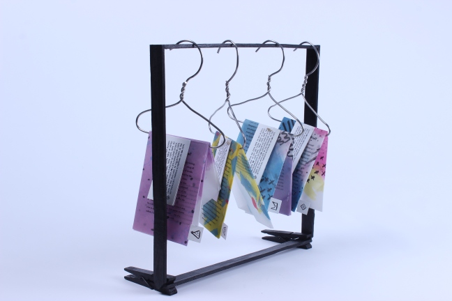
In my most recent project, I created a series of prints inspired by the works of designer Elma De Jonge. I really admire her pattern choices and bold use of black and coloured inks, so I decided to create a series of my own inspired by De Jonge’s aesthetic.

Check her out on Insta: https://www.instagram.com/elmadejonge/?hl=en

The purpose of this experiment was to express myself and my aesthetic in an abstract way: colours, strokes and patterns to match my personality, interests, family history and so on. I used these prints as imagery for part of a zine series which focus on myself as a brand.

Check her out on Insta: https://www.instagram.com/elmadejonge/?hl=en

What does that ZINE?

The task: BRAND YOURSELF. The approach: A ZINE SERIES.

This was a very broad project to take on but with lots of exploration and development into myself as a designer, I decided to create a series of zines which looked at different aspects of my aesthetic and what they to me. I focused on both the Ukrainian and Spanish links within my family and how that affects my lifestyle. I also looked at the personal reasons behind my tattoos as well as my journey with Type 1 Diabetes and how it has been living with an insulin pump. I really enjoy typographic work so jumped at the opportunity to create a series of zines. The elaborate folds and bold patterns made it difficult to typeset the content but I enjoyed the challenge.

IMG_0736

As each of the pages represents a different aspect of my wardrobe and the meaning behind it, I wanted to be more creative with my output. This is why I chose to display each of the zines on hangers. I also developed a collection of symbols inspired by washing and clothing labels for more authenticity within the design.


Noughts & Crosses Design

My design concept was inspired by the Civil Rights Movement. The barbed-wire symbolism is hand-rendered to suggest human fragility and vulnerability, and threatening spikes provide a graphic cross. In contrast, the noughts are identified in the soft pulse of lyrical, handwritten titles. Chalkboard typefaces locate the novel in the schoolroom.

20180704_0147593128520057162454928.png

Penguin Student Design Competition 2018

As a shortlisted entrant to the student design competition, I was invited to an exhibition of the final designs chosen for the award on 20th June 2018. It was great to see the different ideas other designers had taken. And it was great to see my own work presented in a professional manner.


NTU All Sorts

Below are a few examples of design work from the final year degree show, I chose these in particular because of the creative ideas and captivating photography. However, it was was interesting to see the diversity of work throughout the exhibition and how people had taken different approaches to similar tasks.

London BABY!

logo_webuiltthiscity

In 2014, London was named the most visited city on the planet whilst also being home to one of the most creative communities in the world. Located on Carnaby Street, an iconic shopping destination, I quickly came to love the artistic diversity of the shop.

One thing I loved was the vibrant geometric design of the storefront. The store offers the outside space as a unique canvas to many emerging and established London artists, which is just lovely to see.

The prints available inside are very interesting. I love how each designs reflect the creative diversity of London as a city.


DisTOrTioN

This was a project I produced for my Art & Design Foundation. I am very much a do-it-by-hand sort of designer so I quickly looked at ways of portraying the idea of distortion and isolation through hand rendered imagery.

This slideshow requires JavaScript.

My inspiration for this method came from photographer NICK BALLON and conceptual artist ALMA HASER, who used paper manipulation to demonstrate the emotional state of Syrian refugees. Different techniques were designed to suit a variety of stories. For example, ripping the images seemed fitting to represent anger, whilst folds  image helped highlight anxiety or distress.

More at: https://www.savethechildren.net/article/6-stories-6-years-anniversary-photo-series-nick-ballon-alma-haser-visualises-toxic 

These are a few of the images I took as part of my DisTOrTioN project. I visited the Ikon gallery in Birmingham with the intention of finding inspiration for my own work. I used  interesting structures as the subject of my imagery, both in and out of Birmingham.